
THE
AESTHETICS
OF
PAPER
PRINT DESIGN
02
Print design projects are born from attention to detail and the dialogue between form and material. From design to final rendering on paper, each project is designed to enhance the content through functional, coherent, and refined graphic solutions.

BOTTLE LABELS

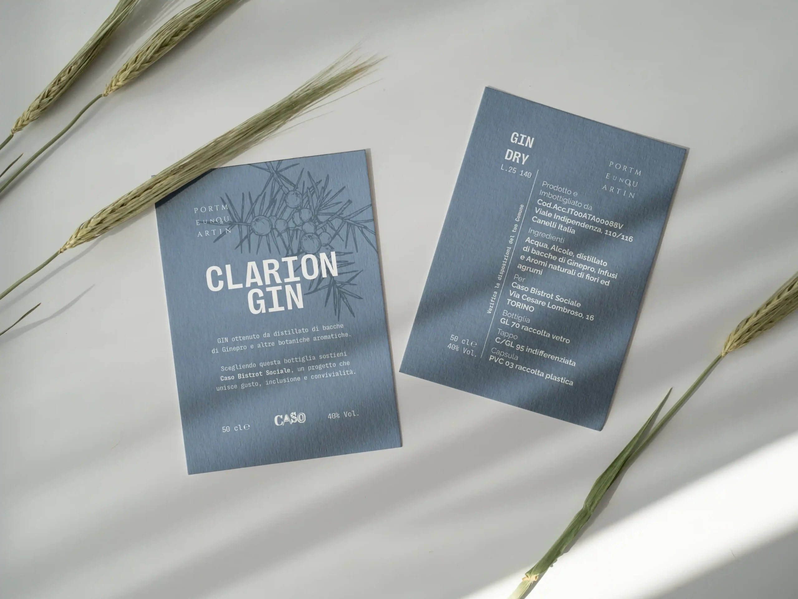
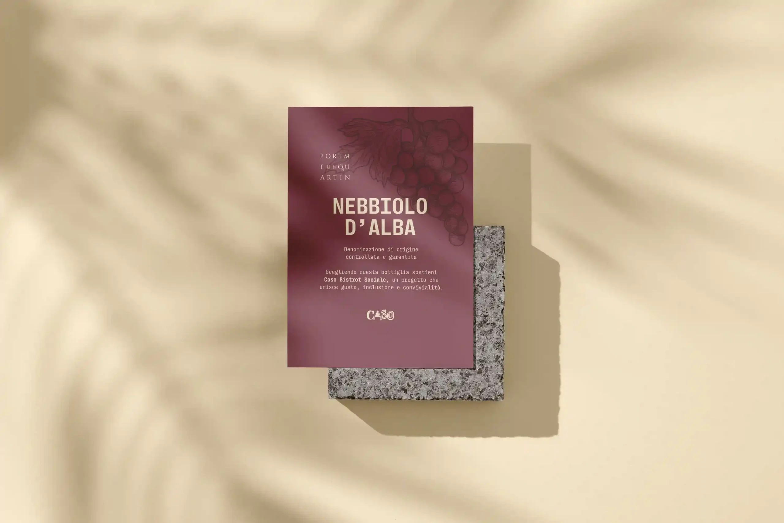
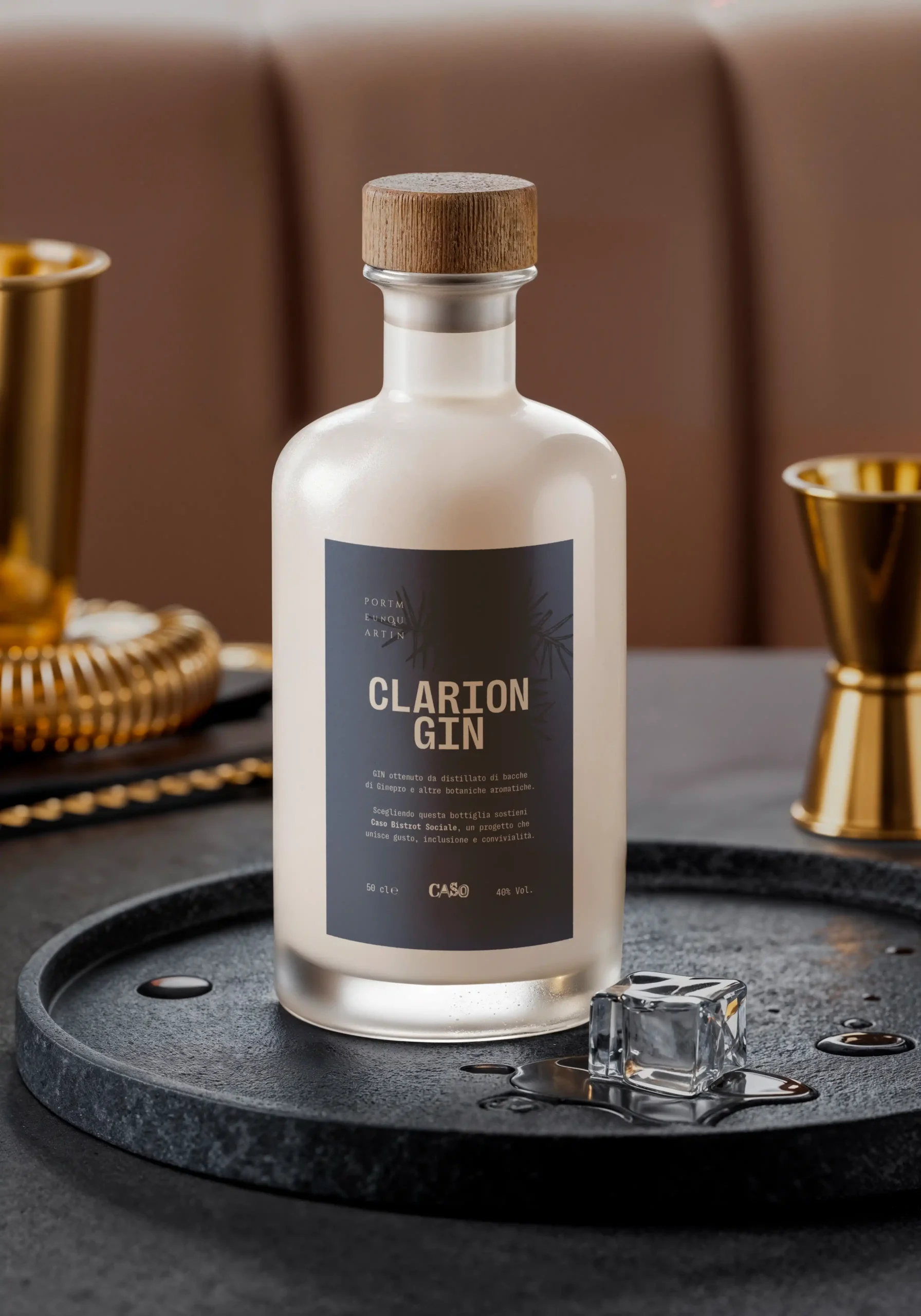
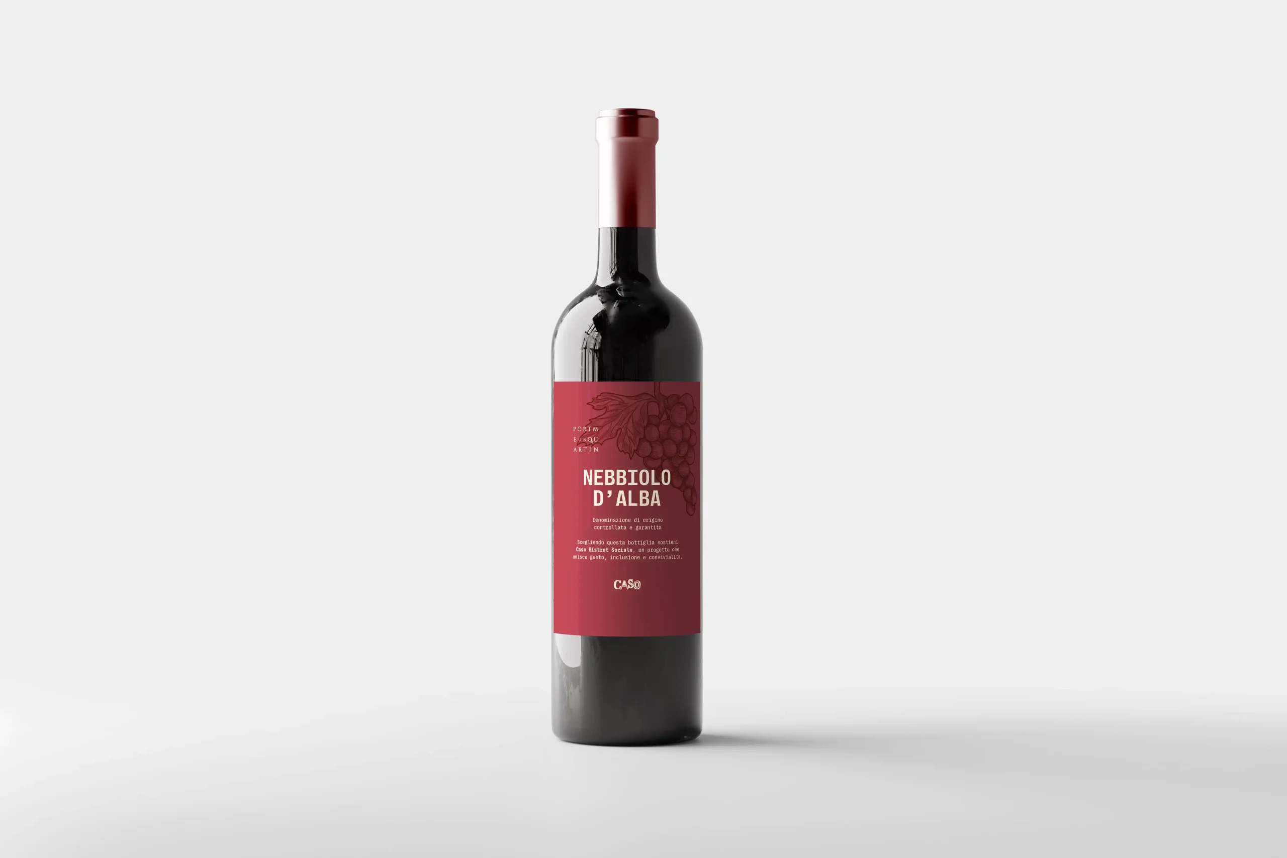
The visual identity for the “Clarion” wine and gin labels was developed for Caso Bistrot Sociale in Turin, with the ambition of transforming traditional packaging into a powerful medium for ethical and social advocacy. The core idea was to reflect the bistro’s mission—social inclusion and community values—through a sophisticated design language. By treating the label as a storytelling canvas, the project elevates the product from a simple beverage to a tangible symbol of human and territorial connection, bridging the gap between fine drinking and social responsibility.
CONCEPT

From a technical perspective, I managed the entire visual roll-out, prioritizing a clean, contemporary aesthetic rooted in a rigorous typographic hierarchy. The layout was meticulously engineered to balance essential regulatory information with the brand’s core message, ensuring that neither sacrificed the other. Every element—from the selection of a refined color palette to the precision of the grid system—was chosen to guarantee maximum readability and elegance. The result is a premium design piece that stands out on the shelf while maintaining a strong, minimalist identity that resonates with the values of Caso Bistrot.
Do you want to change category?
“ERRE drafts” is a creative soul partnering with groundbreaking talents creating emotional and iconic visuals.
About
Behind the project
Goals
Values

Curriculum
Portfolio
Archive
Branding
Print design
3D Modelling
Design
Service
Philosophy
Services
Contact
T number
E-mail
Social
A MULTIDISCIPLINARY DESIGN CONCEPT WHO VALUE CRAFTS AND UNIQUENESS